Blog
The psychology of colour in interiors: how it shapes mood
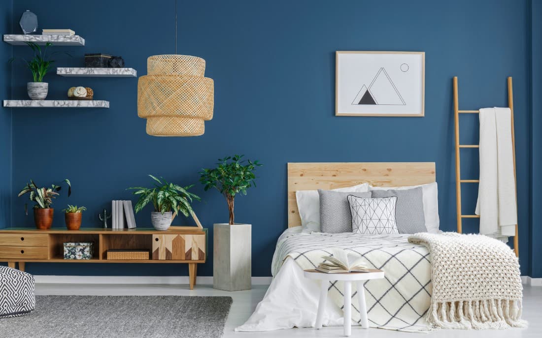
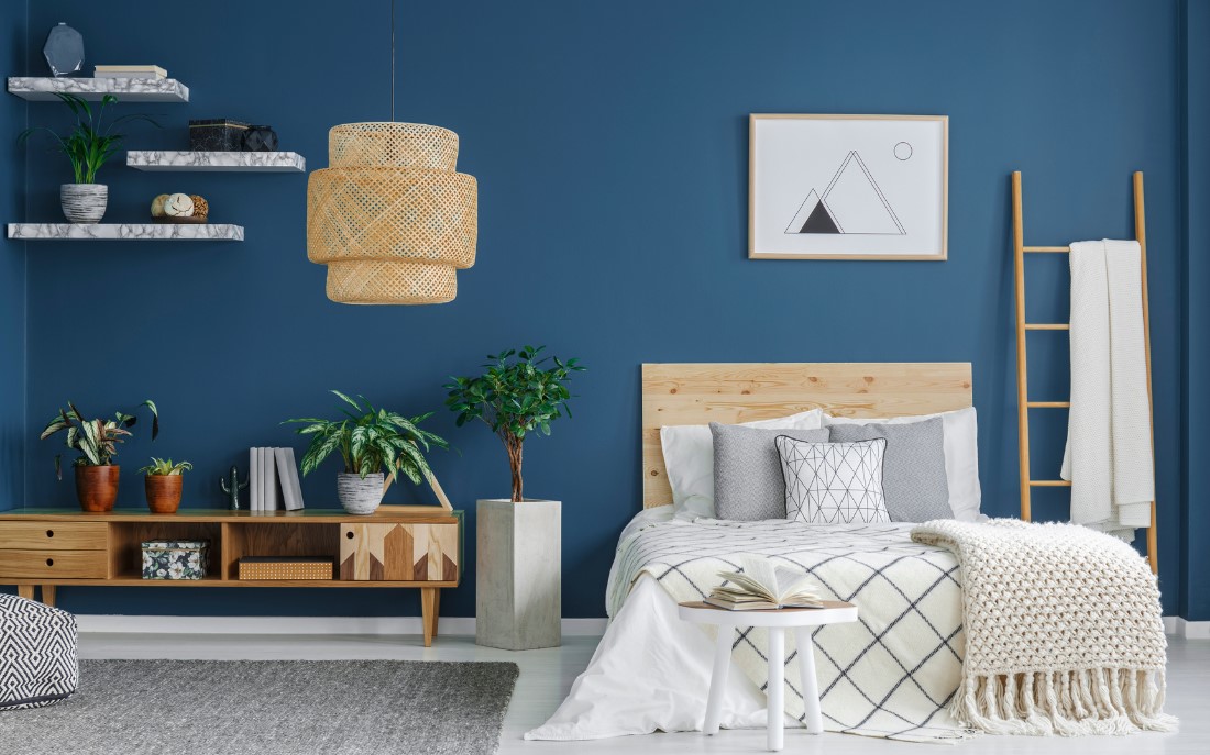
Colors are an integral part of our lives and have a profound impact on our psyche, influencing emotions, behaviors and even physical well-being. In interior design, choosing the right colors is not just an aesthetic question: it is about creating environments that promote relaxation, concentration or energy, depending on your needs.
This article explores the power of colors in interiors and their impact on everyday life, offering practical advice on how to make the best use of them in your home.
The Power of Color Psychology
Color psychology studies how hues affect the mind and body. Over the centuries, different cultures have attributed symbolic meanings to colors, and modern science has shown that they can actually alter mood and behavior. For example:
- The red is energizing and stimulating, but in excess it can be oppressive.
- The blue is relaxing and promotes concentration, ideal for work or rest spaces.
- Yellow is associated with happiness and creativity, but too bright shades can become disturbing.
Understanding how colors influence emotions is essential for designing environments that meet your daily needs.
How Colors Influence Mood
2.1. Warm Colors
Warm colors, such as red, orange and yellow, are associated with energy, warmth and vitality.
- Red: Stimulates energy and passion. It's perfect for social settings like the living room or dining room, but it's best to use it sparingly to avoid an overwhelming effect.
- Orange: It is the color of creativity and optimism. It works well in spaces dedicated to gaming or sports.
- Yellow: Transmits happiness and stimulates communication. Ideal for the kitchen or living room, but better avoided in environments dedicated to relaxation.
2.2. Cold Colors
Cool colors, such as blue, green and purple, have a calming and relaxing effect.
- Blue: Promotes relaxation and concentration. It's perfect for bedrooms and offices, but shades that are too dark can look cold or sad.
- Green: Symbolizes balance and nature. It's a versatile color that works well in any room, especially bathrooms and work spaces.
- Purple: It is associated with creativity and luxury. Light shades like lavender are soothing, while darker ones add drama.
2.3. Neutral Colors
Neutral colors, such as white, gray and beige, are versatile and create a balanced atmosphere.
- White: Symbol of purity and simplicity, it gives brightness and makes spaces seem larger. It's a safe choice, but can feel cold if not balanced with other colors.
- Grey: Refined and modern, it is a perfect base for bolder color combinations. However, too cold shades can seem monotonous.
- Beige: Warm and welcoming, it is ideal for creating relaxing and hospitable environments.
Applying Colors to Different Rooms in the House
Each room in the house has a specific function and requires colors that reflect its purpose.
3.1 Living room
The living room is the heart of the house, where we spend time with family and friends. Here, the colors must create a welcoming and stimulating atmosphere:
- Warm tones: Orange or yellow to promote conviviality
- Neutrals with bright accents: Beige or gray with touches of red or blue for a balanced look.
3.2. Bedroom
The bedroom is a space for rest and relaxation, so the colors must promote sleep and tranquility:
- Cold tones: Light blue, pastel green or lavender.
- Relaxing neutrals: Beige, cream or light grey.
3.3. Kitchen
The kitchen is a place of creativity and activity, and colors should reflect energy and cleanliness:
- Warm tones: Yellow or orange to stimulate the appetite.
- White and bright accents: For a modern and bright look.
3.4. Bathroom
The bathroom is an intimate space that should convey freshness and tranquility:
- Cold tones: Light blue or aqua green.
- Elegant neutrals: White or light gray for a clean and sophisticated effect.
3.5. Home Office
A home office should encourage concentration and productivity:
- Blue and green: To improve concentration and reduce stress.
- Energizing accents: Touches of orange or yellow to stimulate creativity.
Matching Colors with Interior Design
In addition to choosing the right color, it is important to match it correctly with materials, textures and lighting.
4.1. Materials and Textures
- Wood: It pairs well with warm tones such as yellow and orange, but also with neutrals such as beige and grey.
- Metals: Gold and copper stand out with warm tones, while steel and silver combine with cold colors.
- Fabrics: Add cushions, rugs and curtains in complementary shades to enrich the color palette.
4.2. Lighting
Natural and artificial light affect the perception of colors. Test colors in different lighting conditions to make sure they create the desired effect.
Practical Tips for Using Colors in Interiors
- Test before painting: Use paint samples to see how the color appears in natural and artificial light.
- Bithrow contrasts: Use a neutral base and add bright colors as accents.
- Follow the 60-30-10 principle: 60% main color, 30% secondary color, 10% accent color.
The choice of colors in interiors is much more than an aesthetic question: it is a strategy to influence mood and improve the quality of life. Understanding the power of color allows you to design spaces that not only look beautiful, but also meet your emotional and practical needs. Experiment, combine and customize colors to create a home that is a welcoming and inspiring haven.