Blog
Neutral colours — yes, but with personality
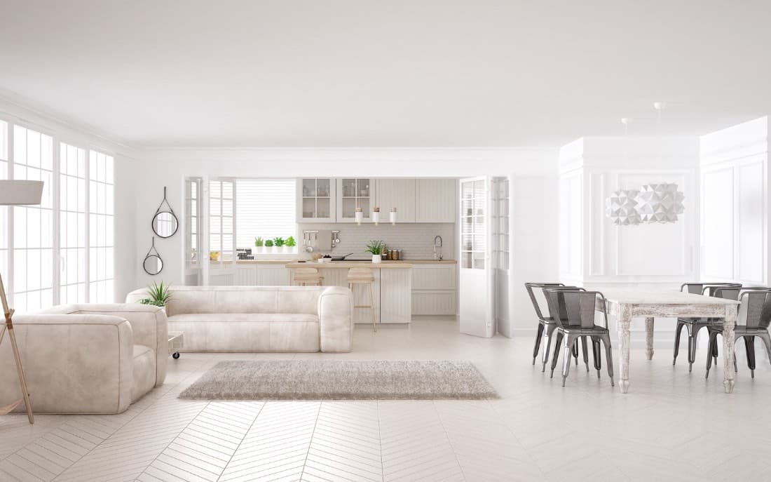
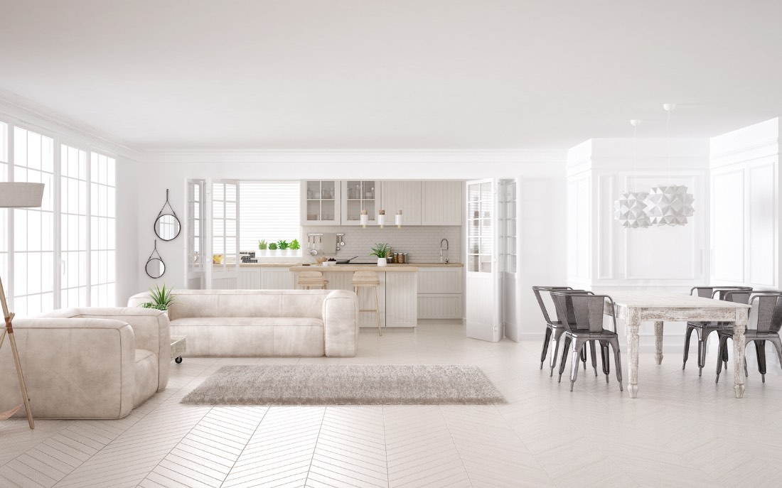
How to avoid the flat effect and obtain a sober but distinctive elegance
In the world of interior design, neutral colors are a timeless choice. Refined, versatile, always current, they represent a safe basis for furnishing any environment. Yet, they are often associated with an idea of monotony, of dull and little expressive spaces. But is it really like that?
The truth is that neutral colors are not at all synonymous with boredom. Indeed, if used with awareness and creativity, they can create warm, sophisticated interiors full of personality. Balance is everything: it's about working with tones, textures, materials, contrasts and details, to avoid the flat effect and build an aesthetic that is sober but distinctive.
What do we mean by “neutral colors”?
When we talk about neutral colors, we are referring to a palette that includes:
- White and ivory
- Gray in all its shades
- Beige and dove gray
- Light browns and sand
- Black, in some contrast variations
- Sage green, greige, terracotta and other “dull” but natural shades
These colors work well in any furnishing style, from minimalist to rustic, from classic to contemporary, and lend themselves to being the basis for more complex solutions or small chromatic touches.
Why choose neutral colors?
There are several reasons why neutrals are a winning design choice:
- They are relaxing: they promote a calm and welcoming atmosphere.
- They match easily: they are compatible with each other and with almost any other color.
- They last over time: they don't follow passing trends.
- They enhance light and space: especially in smaller or poorly lit homes.
- They make an ideal backdrop: they allow you to change style and accents with just a few taps.
But how can we avoid this choice from turning into a flat, impersonal, rhythmless environment?
1. Work by layering
The key to not making a neutral space boring is to think in terms of layering: of colors, of materials, of textures.
For example, in a white and beige living area, you can enter:
- A woven rug in natural fibers
- A wall with concrete effect
- Raw linen cushions
- A satin brass
lamp
- A solid wood coffee table
In this way, the dominant color remains neutral, but the space acquires depth, visual and sensorial rhythm.
2. Exploit textures to bring
to life
Texture is the element that often makes the difference in a monochromatic project. In a neutral interior, every material must tell something.
Try to match:
- A bouclé sofa with a material resin wall
- Microcement floors with light linen curtains
- Raw wood with shiny ceramic
- Natural stone with burnished metal
The textures, when well dosed, break the static and enhance even the most sober shades. The result? An elegant and never banal environment.
3. Playing with tones on tones
One of the most refined strategies for working with neutral colors is to use the tone-on-tone technique.
It means choosing different shades of the same color (for example from lighter beige to warm brown) and distributing them harmoniously in the space.
This choice guarantees:
- Visual coherence
- Depth without sharp contrasts
- A sober and enveloping aesthetic
A tone-on-tone palette can be very sophisticated, especially when combined with natural materials or metallic details.
5. The strength of natural materials
One of the secrets to giving warmth and identity to neutral interiors is to use natural materials. Wood, stone, raw cotton, artisanal ceramic: they are all elements that communicate authenticity, making the space welcoming and personal.
In particular, wood (light or dark) pairs beautifully with neutrals, breaking up the visual uniformity and addingbringing matter and depth to the design.
6. Small touches of “off” color
Another interesting trick to liven up a neutral environment is to insert some secondary colors with desaturated shades.
Let's talk about:
- Sage green
- Powder blue
- Powder pink
- Burnt mustard
- Brick or rust
These shades, while maintaining a low visual impact, give a unique chromatic signature that expresses personal taste without overpowering the neutral style.
7. Neutral walls, but not necessarily white
When talking about neutral colors for walls, you shouldn't limit yourself to the classic optical white. There are infinite warmer, more enveloping, more sophisticated variants:
- Cream white
- Warm light gray
- Sand beige
- Soft mole
- Greige (grey + beige)
Even a small shift in undertone can completely change the mood of a room. Choose carefully based on exposure to light, intended use and furnishings.
8. Accent lighting
Good lighting is essential to enhance a neutral palette.
In particular, it is important to enter:
- Warm lights (2700K-3000K) that restore softness
- Accent lamps on textured walls or furnishings
- Indirect sources (grooves, LED strips) to create atmosphere
Light, modulated in the right way, manages to enhance the depth of neutral materials, preventing them from appearing flat or dull.
9. Enter unexpected details
Do you want to give a unique signature to your neutral space? Introduce an element out of context, but perfectly balanced:
- A material framework
- A colorful designer chair
- An impressive green plant
- A carpet with a soft geometric pattern
These details break up the monotony without compromising the overall coherence, and help make an interior that might have seemed “too clean” memorable.
10. The personal touch
Finally, the real key to giving personality to a neutral environment is to make it authentically yours.
Sometimes enough is enough:
- A selection of black and white photographs
- Items found on trips
- Books, records, small sculptures
- A work of art or graphic print
Neutral colors are an ideal backdrop to tell a story, yours.
Neutral colors yes, but with character.
The secret is not to stop at the surface, but to build a space that is harmonious, vibrant and personal.
Sobriety does not mean the absence of style: it means balance, care and awareness. And when neutral is designed with love, it becomes timeless elegance.